

Ana Adelaide :: Brand Identity
Ana Adelaide is a therapist that merge different methods in order to create a custom therapy to each person. She understands people as singular individuals that deserve deep analysis of their case before recommending a treatment. Her style of working is inclusive, without judgements. It's like a comfortable place, where people feel welcome and free, thus achieving results faster than conventional therapies.
My duty was translate the main attributes and brand's mood into a simple visual language to use in her social media.
Branding, Graphic Design, Art Direction

Leão :: Visual Identity
Leão is one of the most recognized and classic foods & beverages brands in Brazil.
The brand has started in 1901, by the name of Matte Leão, selling teas made from mate herb (ilex paranguariensis).
Leão has been increasing its range of products in the last decades and in 2007 the brand was bought by Coca Cola Company.
This project was developed as a creative exercise with the objective of updating, reinforcing and diversifying the brand's visual.
Thus, following the growth of the product catalog and unlinking the brand image with, only, mate herb tea.
Branding, Packaging, Art Direction

ITSINK.com
Itsink.com is an e-commerce, from Dubai, where they sell customized items, such as garments and phone cases.
The main inspiration for the visual identity was to illustrate the creativity and freedom of painting and stamping everything you want.Due to the variety of applications, the identity has been built based upon colorful and modular graphisms that can help creating lots of possibilities.
Branding, Icon Design, Packaging
Dubai, Arabic Emirates - 2016
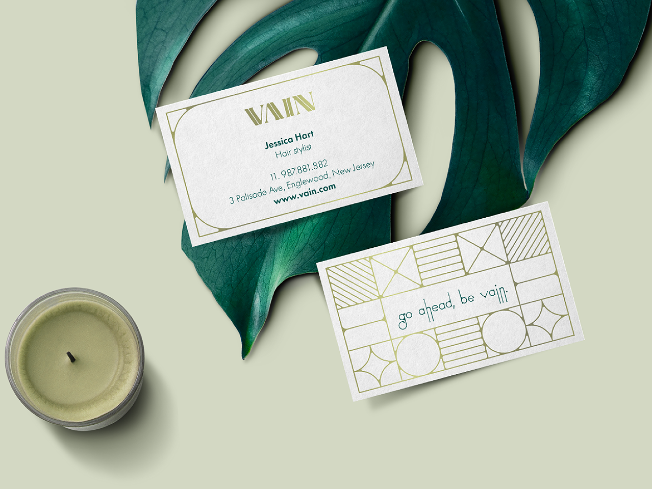
VAIN
Vain is a hair salon based in New Jersey. The space invites the client to a luxurious space with high qualified professionals. It's style is focused on elegant and minimal women:
“Our client is the modern, elegant and successful woman. She doesn’t want to experiment with her style. She has a strong sense of her personal style but she wants her stylist to give her look that “edge” she wants.”
The brand is supported by 3 pillars that were used as the start for the identity design: The brand design must show a fresh, luxurious em edgy style.
Branding, Fashion, Graphic Design
New Jersey, USA - 2017
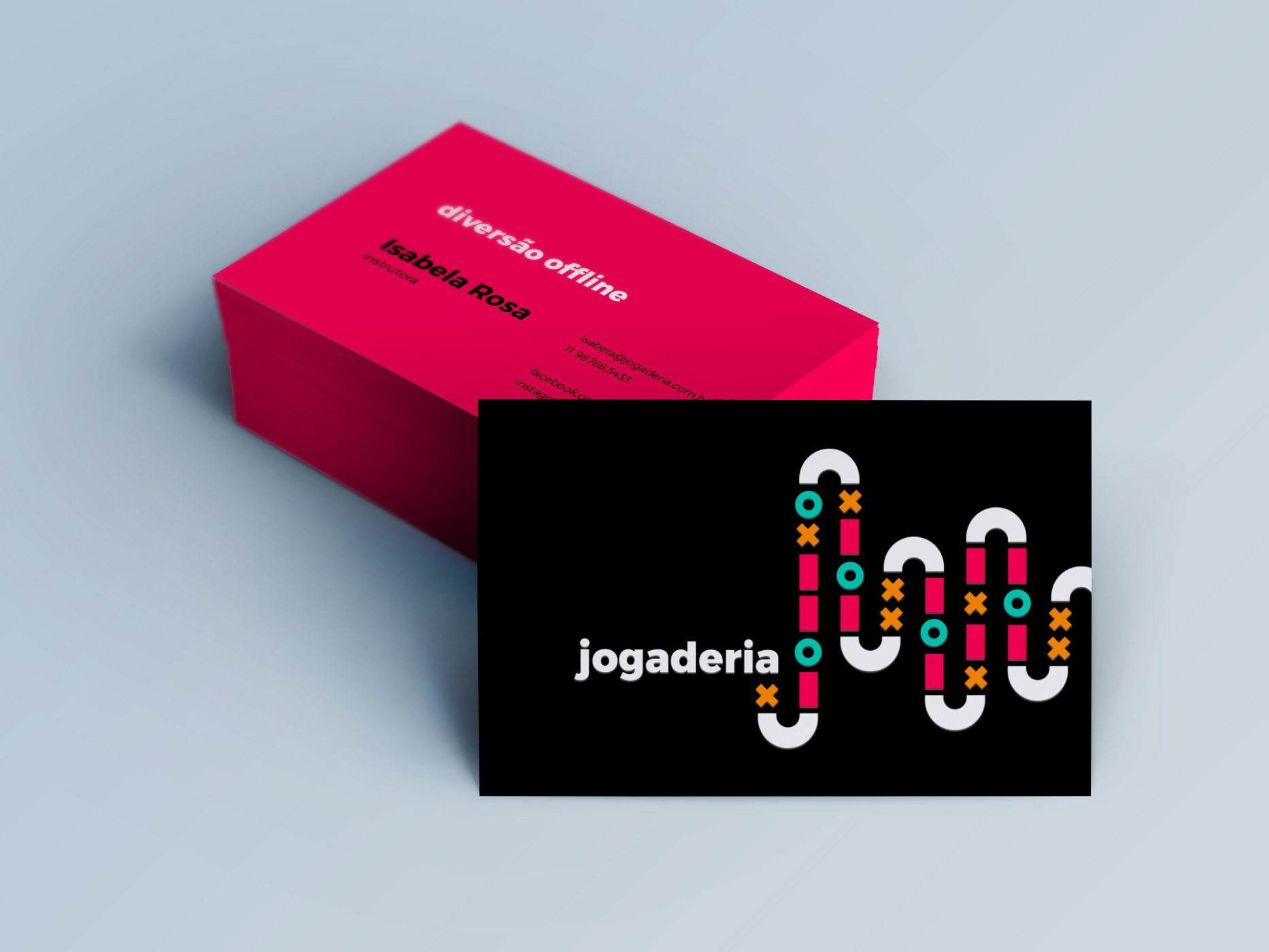
Jogaderia
Jogaderia is a young company that works renting boardgames inside restaurants.
Our mission was to develop an inviting brand identity, that shows how fun and simple can be spending time playing with friends.
Branding, Graphic Design
São Paulo, Brazil - 2016
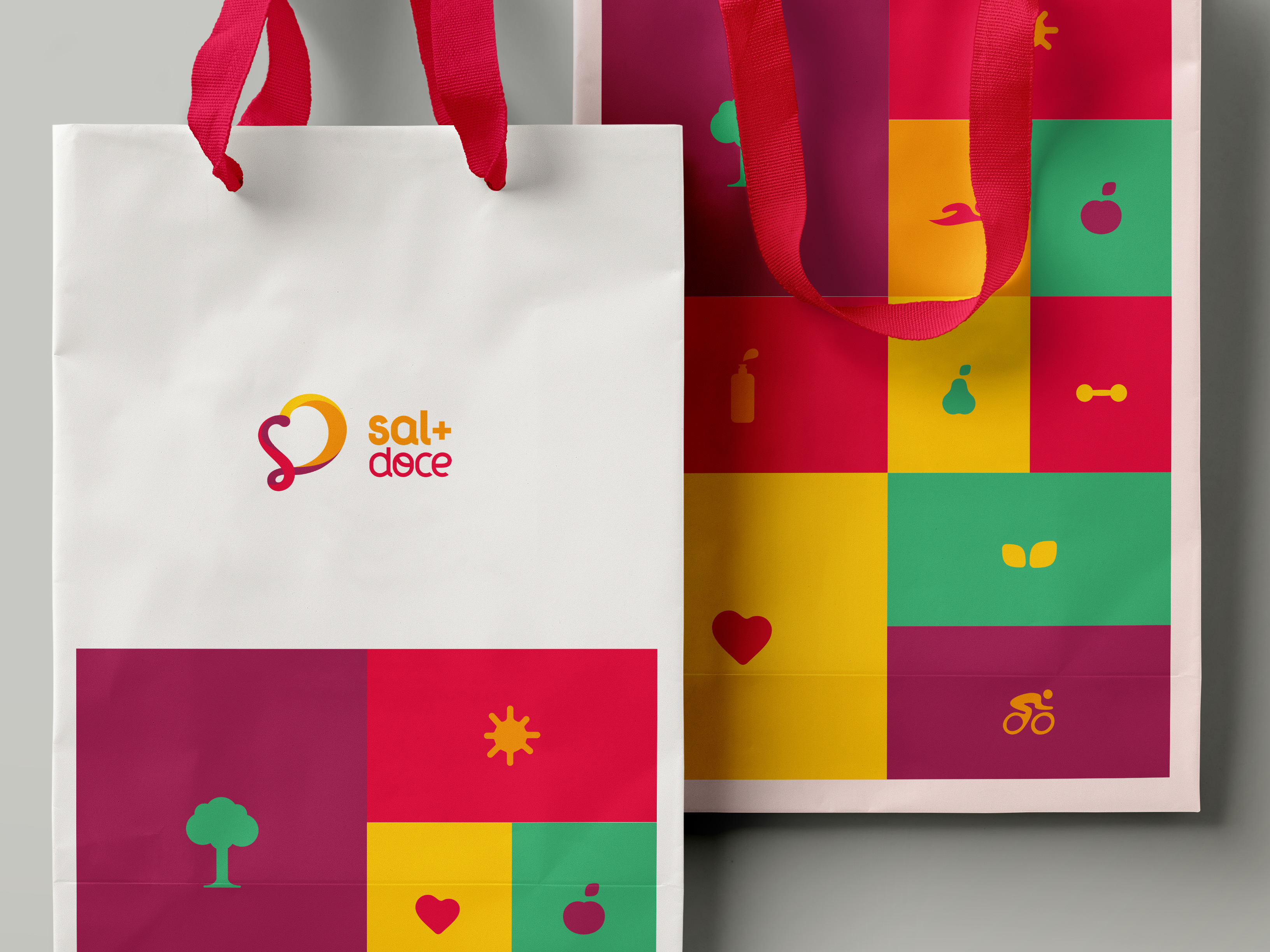
Sal + Doce
This logo was created for a health foods store where they sell natural grains, cereals, spices and some candies too. The symbol is derived from the words (Sal + Doce) and is based upon the concept of self-love and self-care.
Branding, Graphic Design
São Paulo, Brazil - 2013
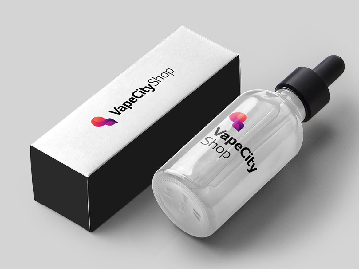
VapeCityShop
VapeCityShop is an e-commerce, from Compiègne - France, where they sell vaporizers, essences, e-cigarettes and more. My mission was to design a new logo, more original and closer to the product's universe. However, still colorful (yay!).
Branding, Graphic Design
Compiègne, France - 2017

Lacuna Filmes
Brand identity developed for a movies producer from Brazil.
The leading idea was design a shape that suits the style of each film while it continues with a strong and remarkable identity.
The brand mission is to bring, through the entertainment, the audience to think about real life subjects, as well as sexuality, feelings, policy, etc.
Hope you like the result. :)
Branding, Graphic Design
São Paulo, Brazil - 2013

Nokone
Nokone is a Nipobrazilian restaurant (yes, that's right) and its main differential to be explored is the way that they mix brazilian and japanese food. Even in its name there are both cultures: NOKONE sounds like a japanese word, however it means "inside the cone" in portuguese. That's because the specialty of the restaurant is Temaki.
They wanted to look like a happy brand that mixes Brazil and Japan in a funny way.
Our task was to transmit all of that using a logo and some variations, and we made it. :)
Branding, Graphic Design, Illustration
São Paulo, Brazil - 2015

Pause FX
Pause FX is a digital art studio, based in Selangor, Malaysia, that works mainly with CGI, 3d and motion effects.
They wanted a living logo, that could illustrate their activities.
Art Direction, Branding, Graphic Design
Selangor, Malaysia - 2015
Dias & Silva
Fernando Dias & Silva is a lawyer office, based in Juquitiba, Sao Paulo for 20 years.
The brand reputation has been built, along the years, on the honesty and commitment to find the solution for the customer.
They work mainly in five areas: family, civil, employer labor, real estate and environmental. They are highlighted for their effective solutions in these segments.
To keep the recognition and the office differencials, the brand must be remembered with the following characteristics: honesty, competence and commitment.
Branding, Graphic Design
São Paulo, 2014