
Client: Jogaderia | Year: 2016
Jogaderia
BRAND IDENTITY
Jogaderia is a young company that works renting boardgames inside restaurants.
Our mission was to develop an inviting brand identity, that shows how fun and simple can be spending time playing with friends.
_________________________________
[Step 1.] BOARDGAMES PERCEPTION
We invited 72 people to answer a few questions to know their perception about boardgames.
46% Enjoys playing
They comprehend boardgames are a nice way to have group entertainment and fun.
Good attributes: Collective, funny, friendly.
54% Doesn't play
49% Thinks that boardgames are made just for children, so they doesn't fit teenagers and adults;
5% Thinks that boardgames are too complicated and monotonous.
Bad attributes: Complicated, Childlike, Monotonous, Slow.
_________________________________
[Step 2.] SHAPE PERCEPTION
We conducted a survey to know the how people react when they see common shapes to the universe of boardgames andwhen they see some abstract shapes that we could use in the logo.
2.1 Shapes that people related to the good attributes:

2.2 Shapes that people related to the bad attributes:

_________________________________
[Step 3.] ANALISYS
[Step 3.] ANALISYS
We analyzed the shapes that were related only with the good attributes and we found the similarities between them:

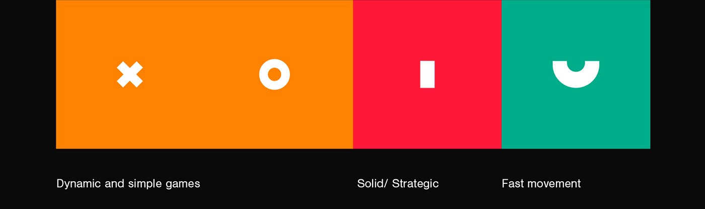
First group: The shapes are simple and belongs to simple and fast usual games.
Second group: The shapes have rounded corners. The third shape seems to be a group, however it keeps the simplicity.
General: Most of the shapes aren't conected, they are a group of objects together. There aren't symmetrical objects.
Solution:
_________________________________
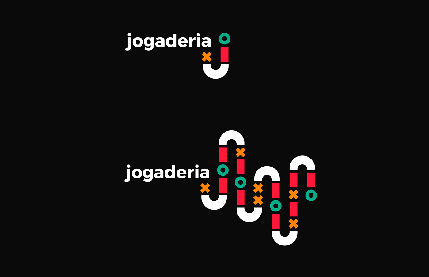
[Step 4.] FINAL LOGO
The logo seems to be a boardgame path and also can be expanded:


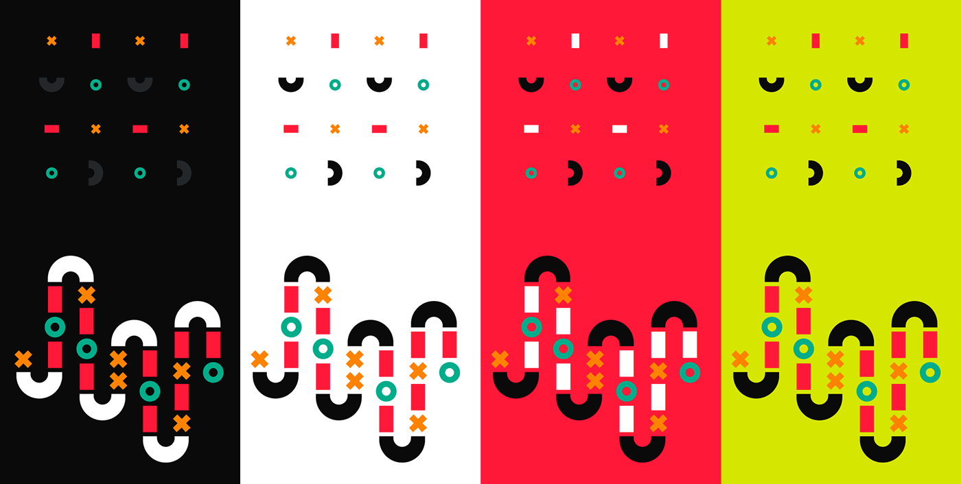
[Step 5.] COLORS

[Step 6.] TIPOGRAPHY

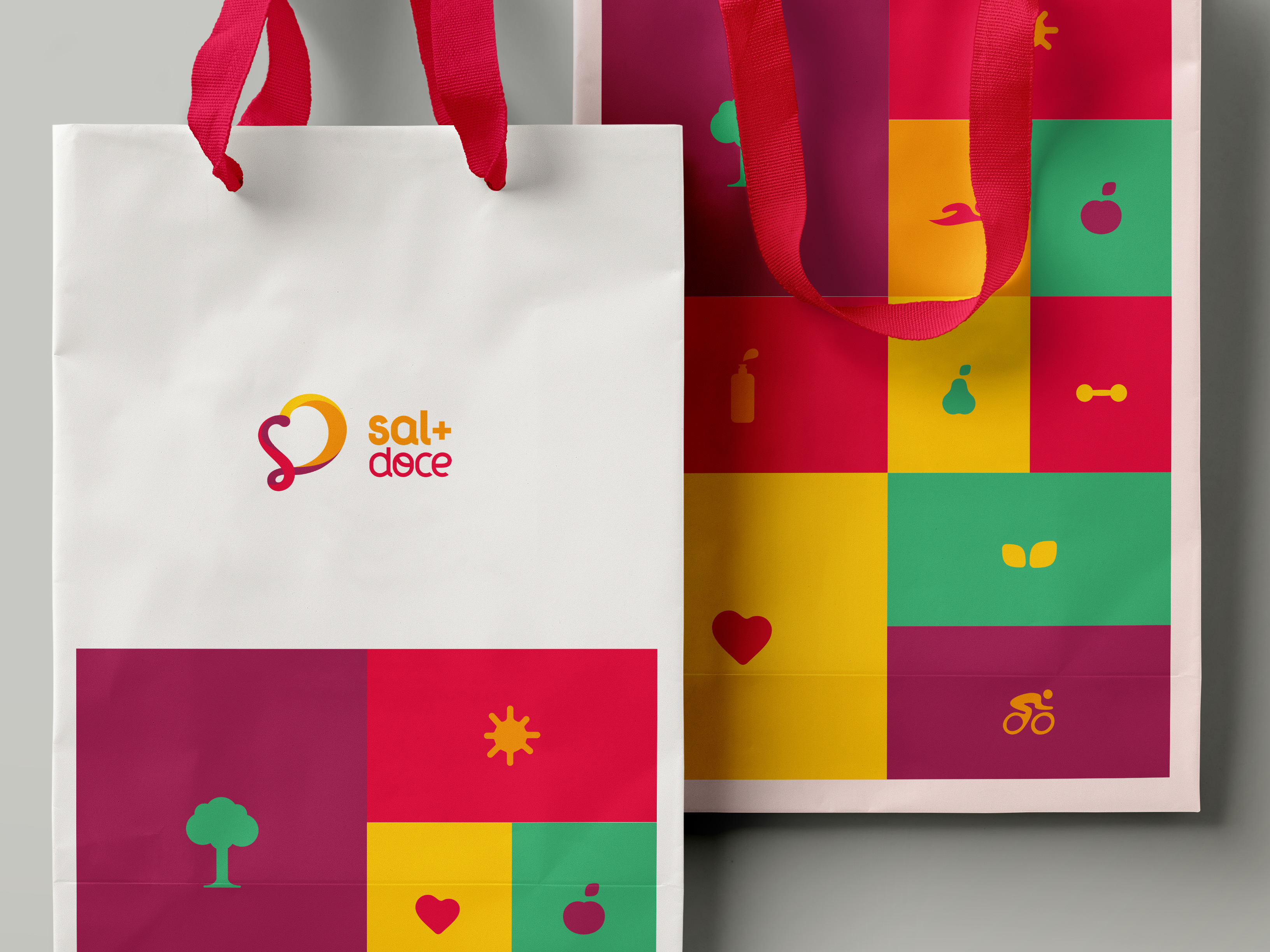
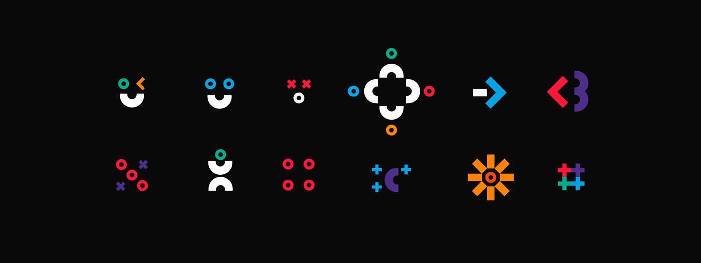
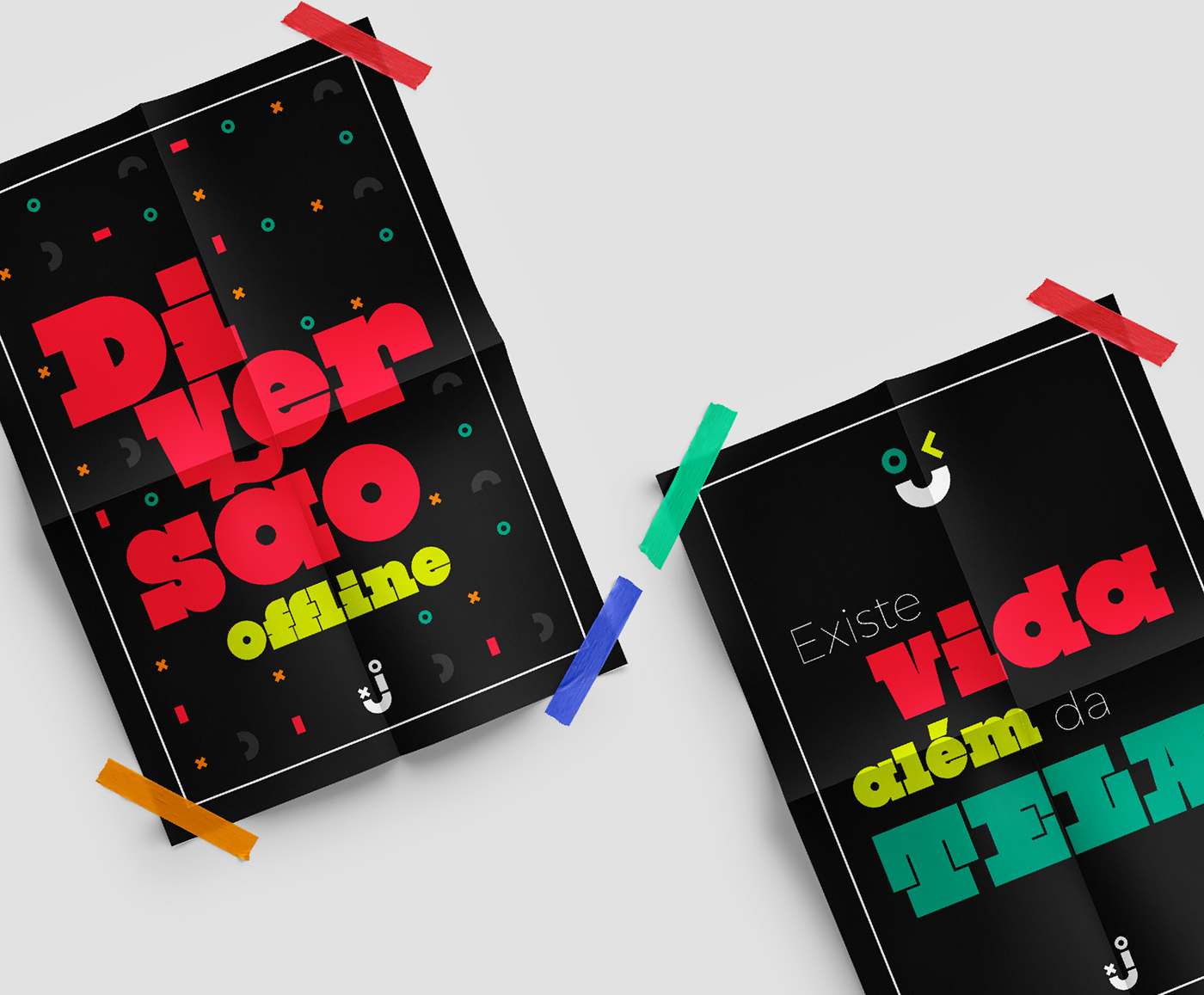
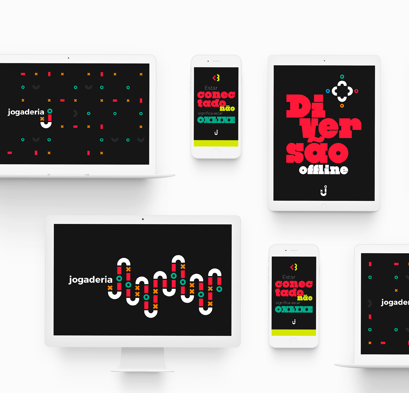
[Step 7.] SUPPORT GRAPHICS
[Step 8.] BRAND IDENTITY IN USE


Thank you!
Follow our work: facebook.com/rontudesign