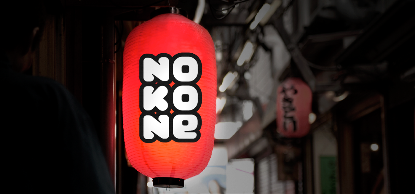
Year: 2015 Client: Nokone
Nokone Identity
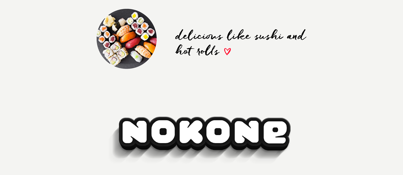
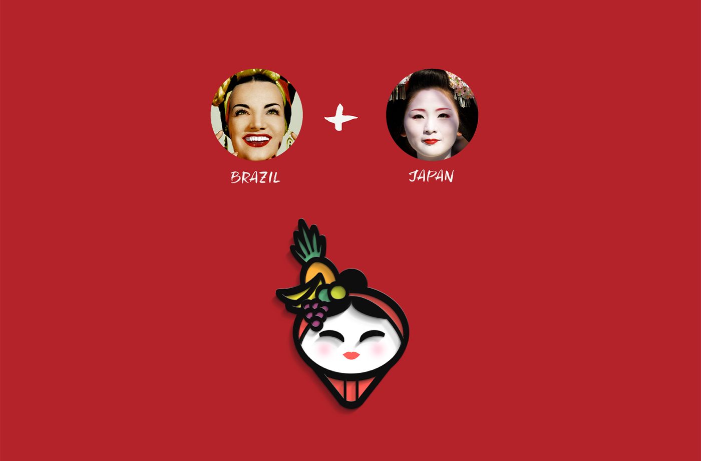
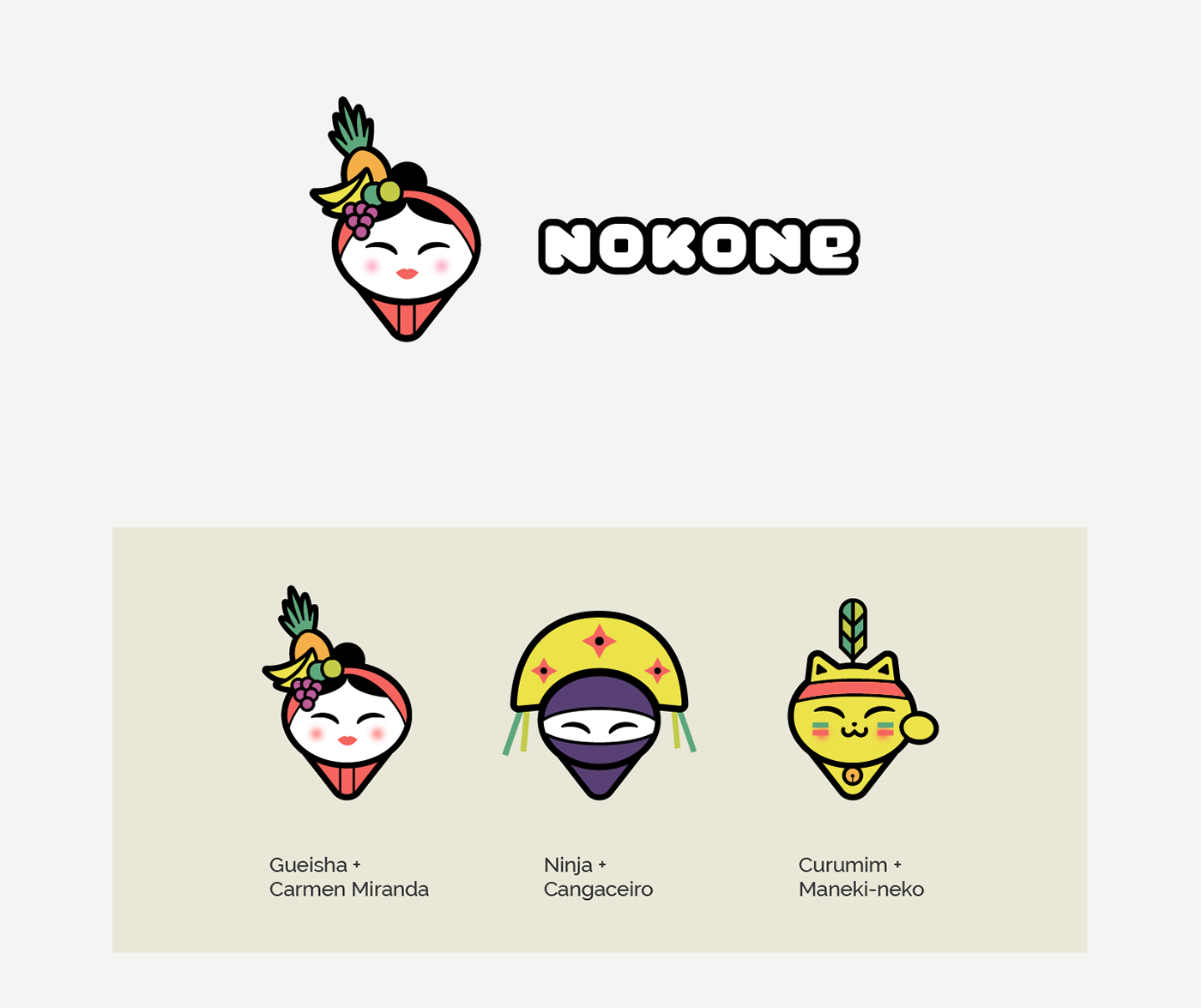
Nokone is a Nipobrazilian restaurant (yes, that's right) and its main differential to be explored is the way that they mix brazilian and japanese food. Even in its name there are both cultures: NOKONE sounds like a japanese word, however it means "inside the cone" in portuguese. That's because the specialty of the restaurant is Temaki. They wanted to look like a happy brand that mixes Brazil and Japan in a funny way. Our task was to transmit all of that using a logo and somevariations, and we made it. :)
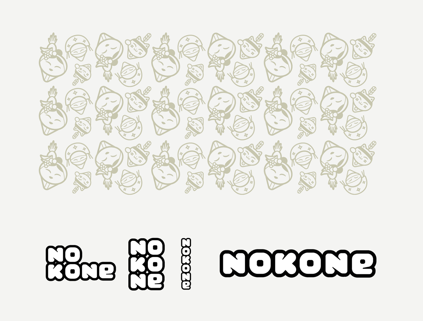
1. Lettering
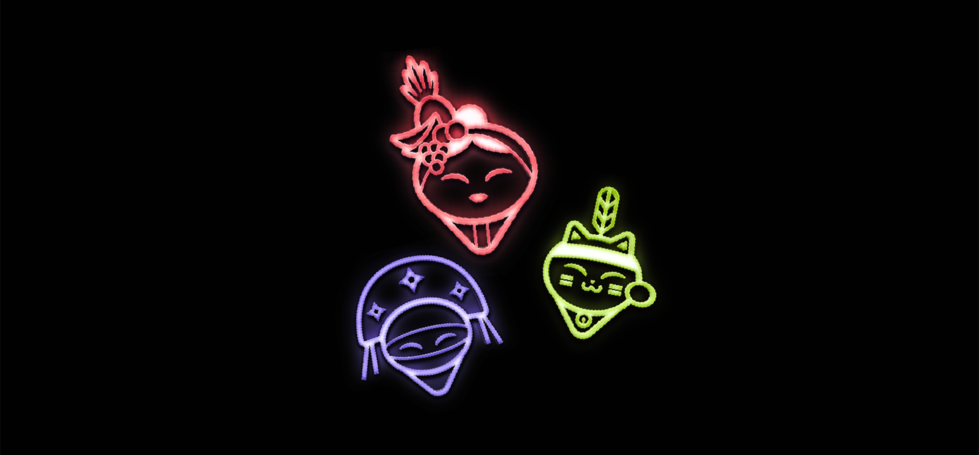
2. Symbol
3. Logo
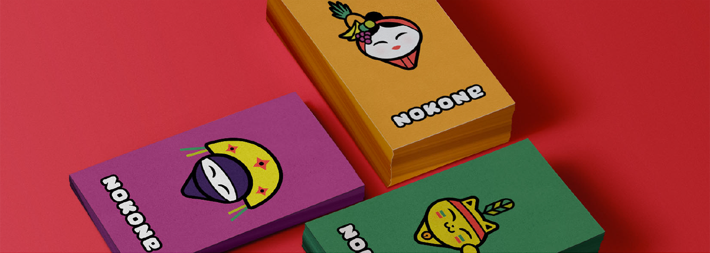
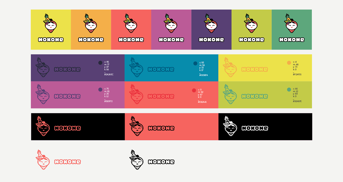
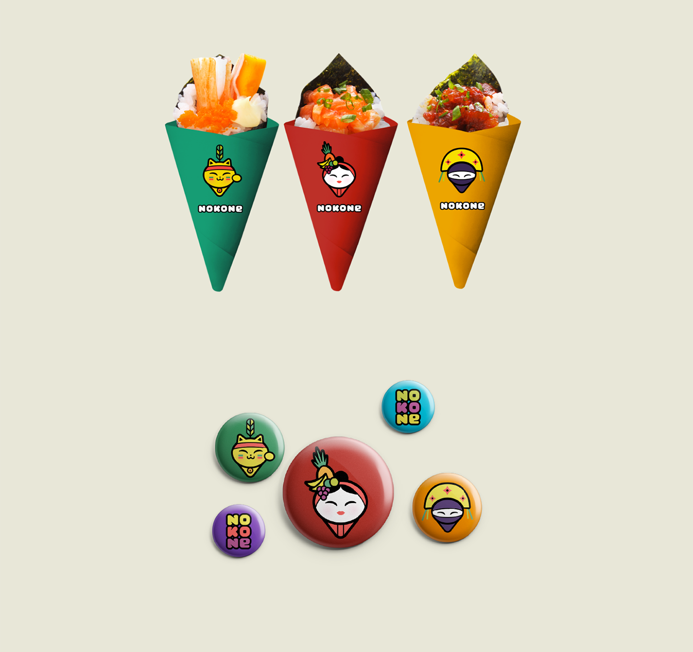
4. Colors and variations

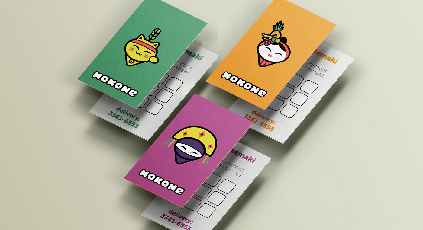
5. Identity in use

Thank you!