Leão
Personal Project, 2018.
Brand and Packaging.
Leão is one of the most recognized and classic foods & beverages brands in Brazil.
The brand has started in 1901, by the name of Matte Leão, offering tea made from mate herb (ilex paranguariensis).
Leão has been increasing its range of products during the last decades and in 2007 the brand was bought by Coca Cola Company.
This project was developed as a creative exercise with the objective of updating, reinforcing and diversifying the brand's visual.
Thus, following the growth of the product catalog and unlinking the brand image with, only, mate herb tea.
1.
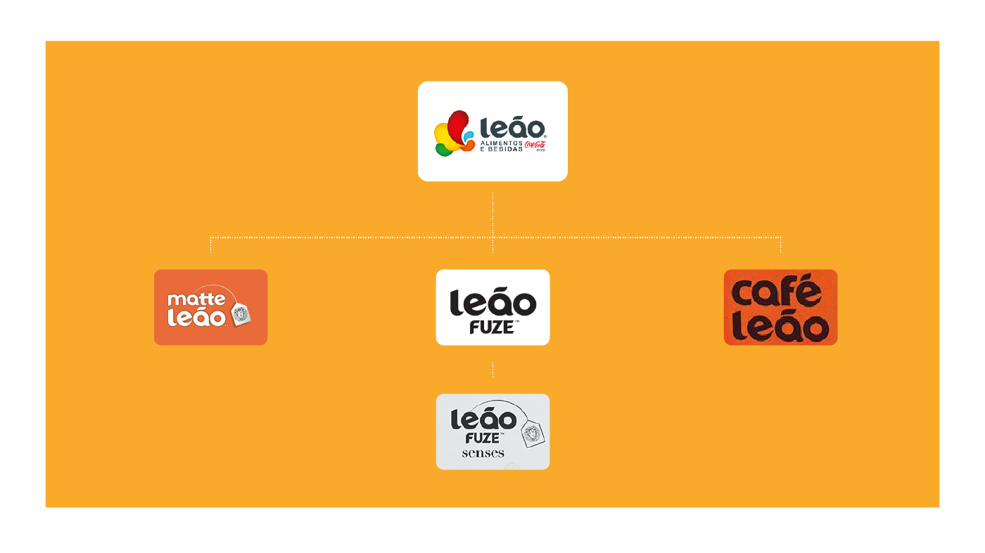
Current identity
1.1 Logos
The current logo designs doesn't seem to folllow a structure for the size of the letterings.
It's not clear if there's a symbol that connects the sub brands, since some of them use the Lion as a element and others don't.
The symbol used on the mother brand looks very generic and does not represent the brand.
Despite the smooth terminations on "Leão", it doesn't seem naturally gestual.
1.2
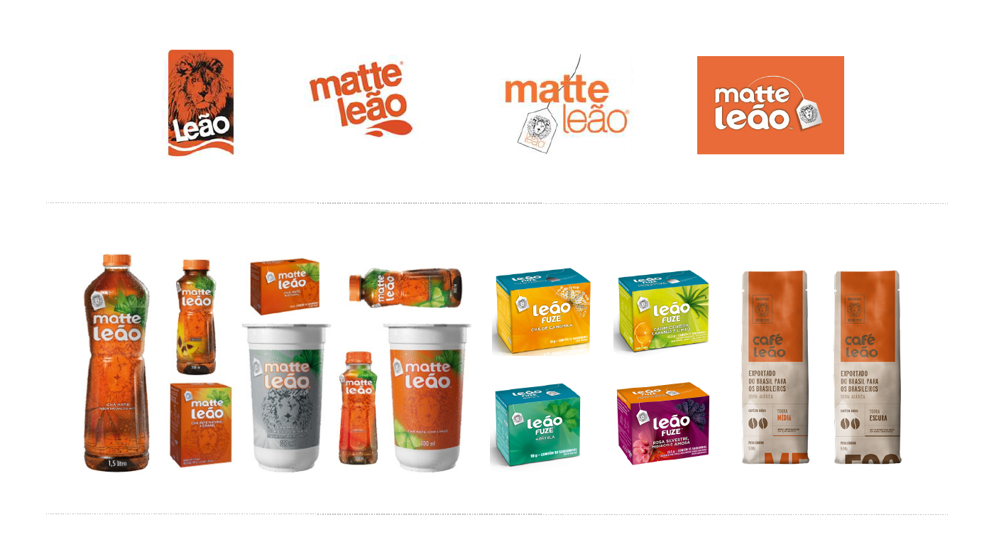
The lion
The lion lost a big part of its presence on the brand along the years.
1.3
Packaging
Matte Leão and Leão have clear connections on the visual identity. Both of them are tea brands, so it's possible to unify them into a single brand.
The lion repetition on the tea packages can be eliminated and replaced with a bigger and clearer image of the lion's face.
2.
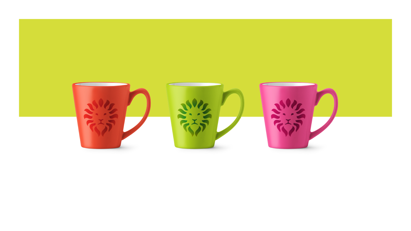
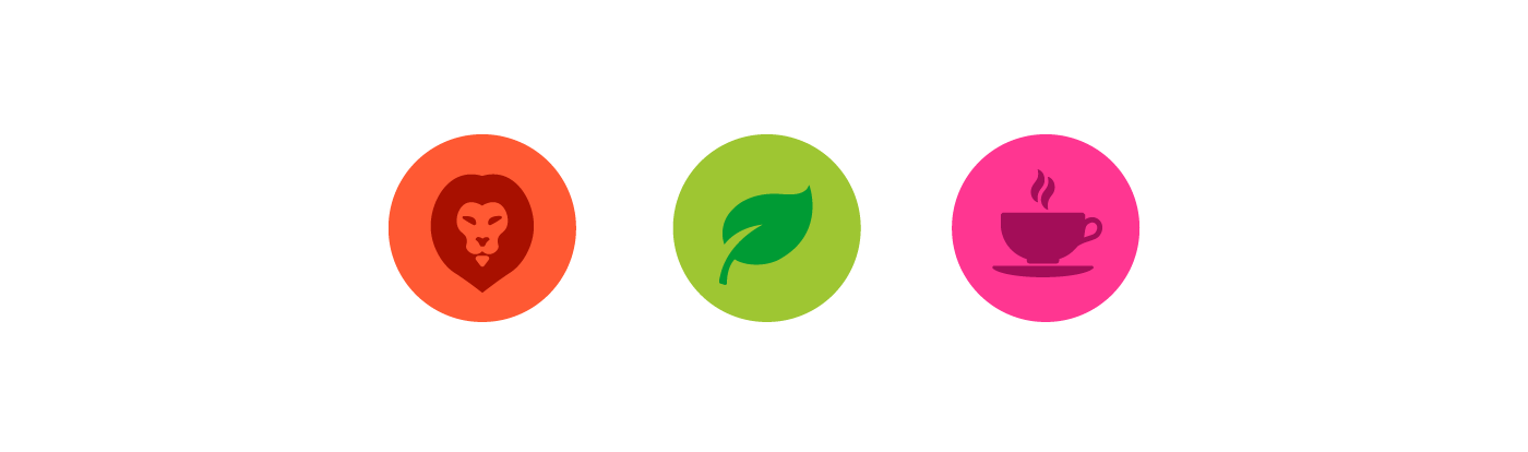
The new lion
The lion as a symbol and a support graphic
This project was developed as a creative exercise with the objective of updating, reinforcing and diversifying the brand's visual.
Thus, following the growth of the product catalog and unlinking the brand image with, only, mate herb tea.
Tradition + Natural + Cozy

3.
The new logos.

4.
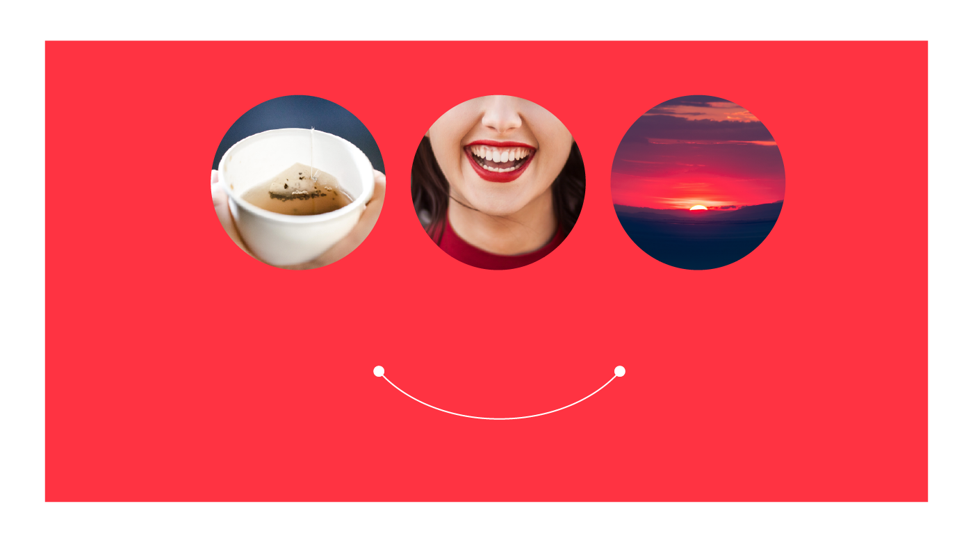
Support Graphic
The curved line
The line represent the front view of a tea cup. It also can be associated with happiness and the beauty and peace of a sunrise.
5.
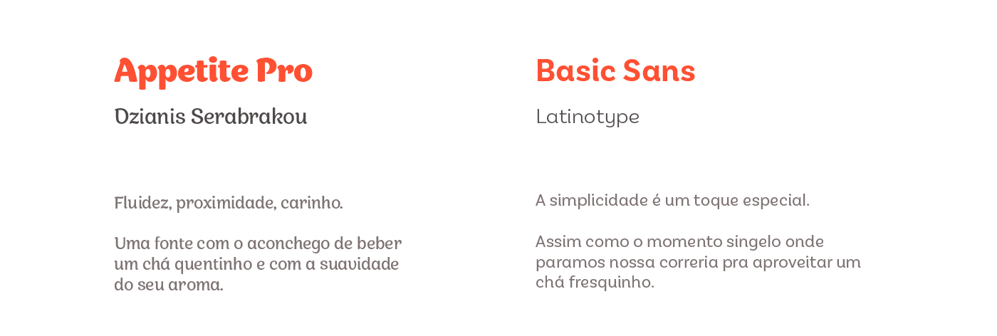
Typography
6.
Look & Feel

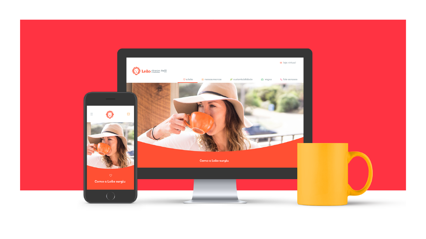
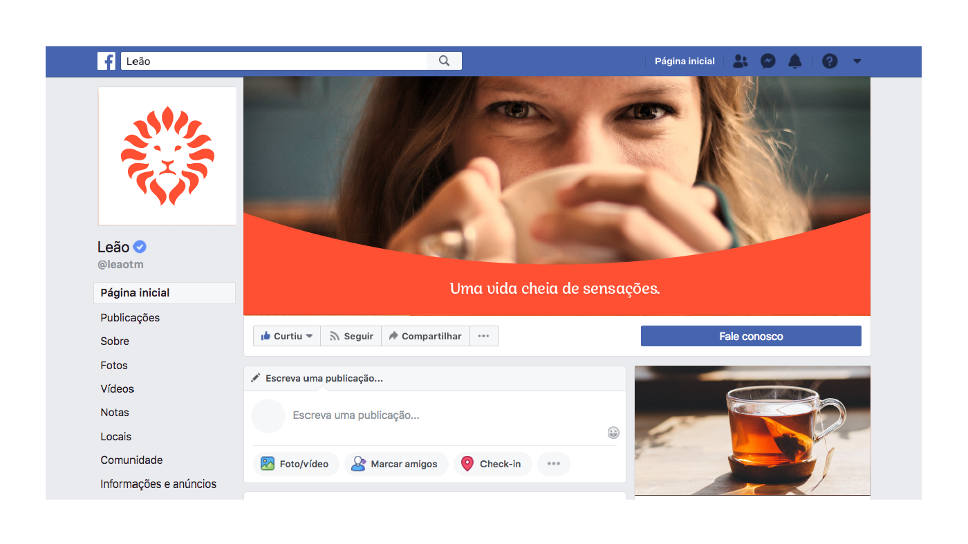
7.
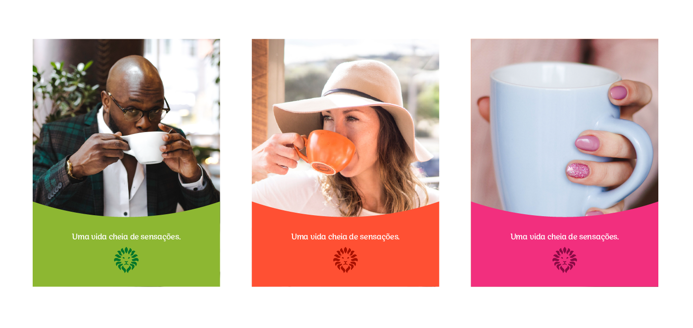
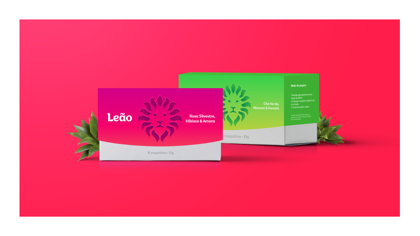
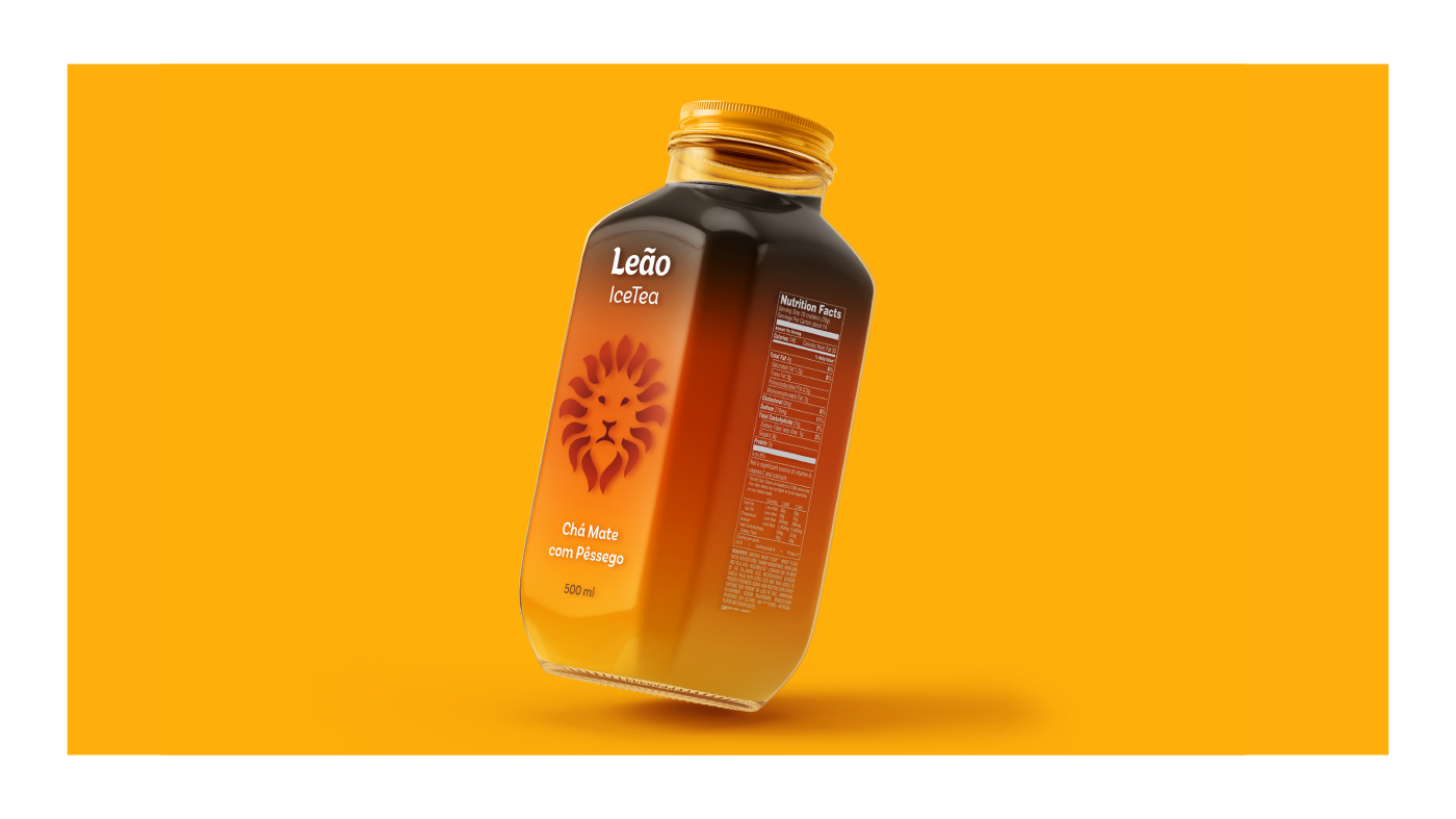
Packaging
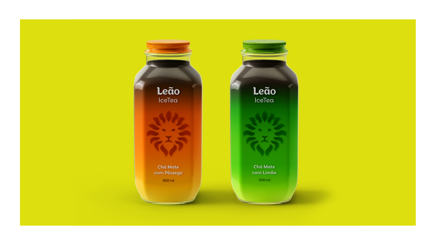
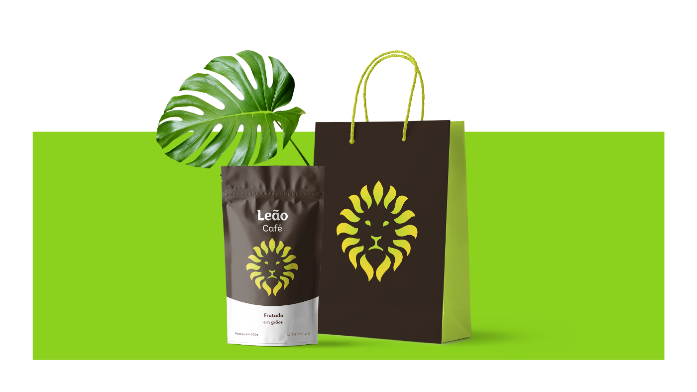
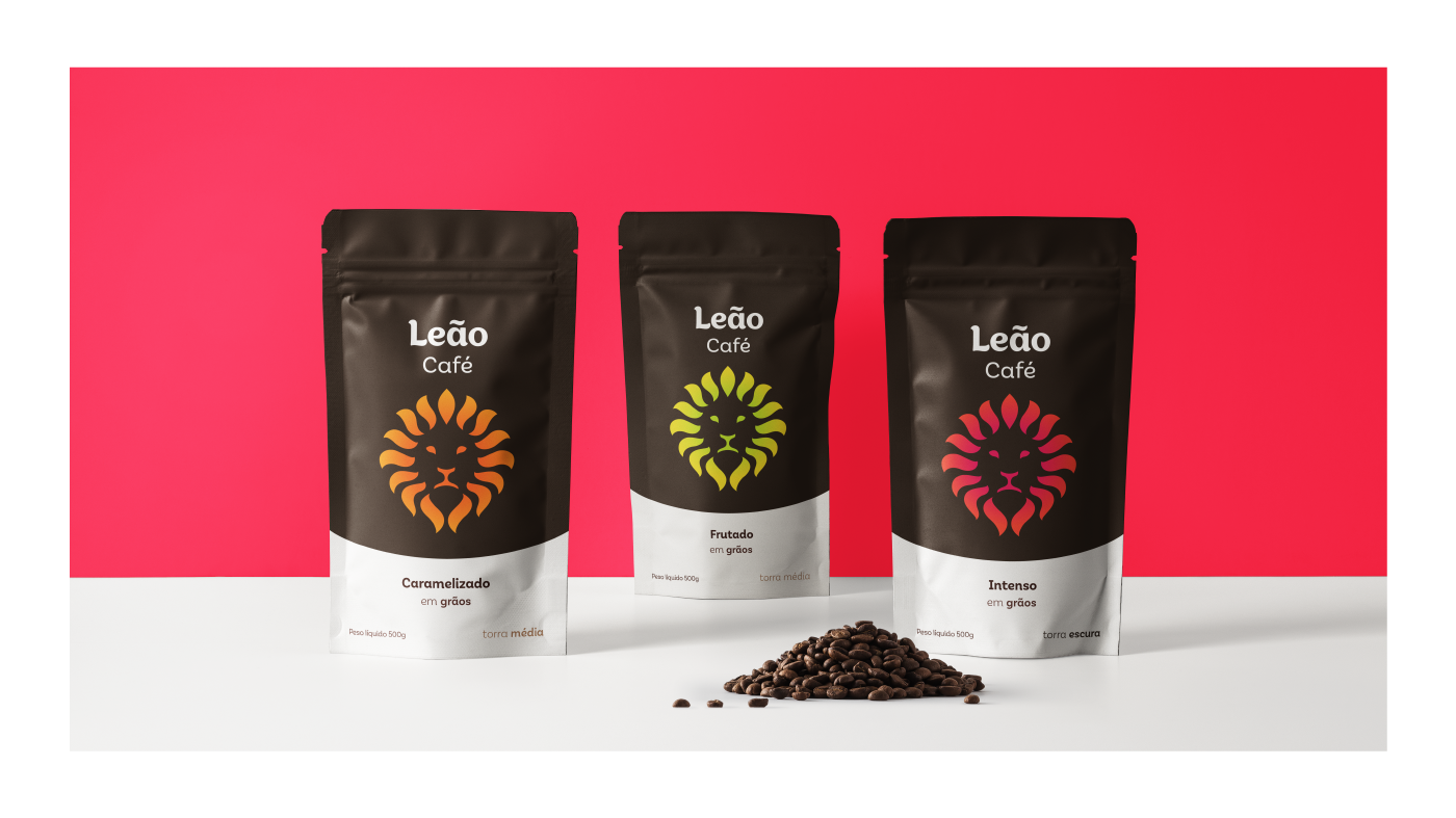
Simple and clear.
I've decided to try a very simple solution, where only the colors represent the tea flavor. Using strong color masses, the boxes will be noted easily. Here, the Lion isn't used as a logotype. I'm using it as a support graphic, like a power brand. So, in the future, the brand can get rid of the lettering in some situations and can still be recognized.
7.1
Tea

IceTea
Café
Thank you!