
Year: 2013 | Client: Sal+Doce
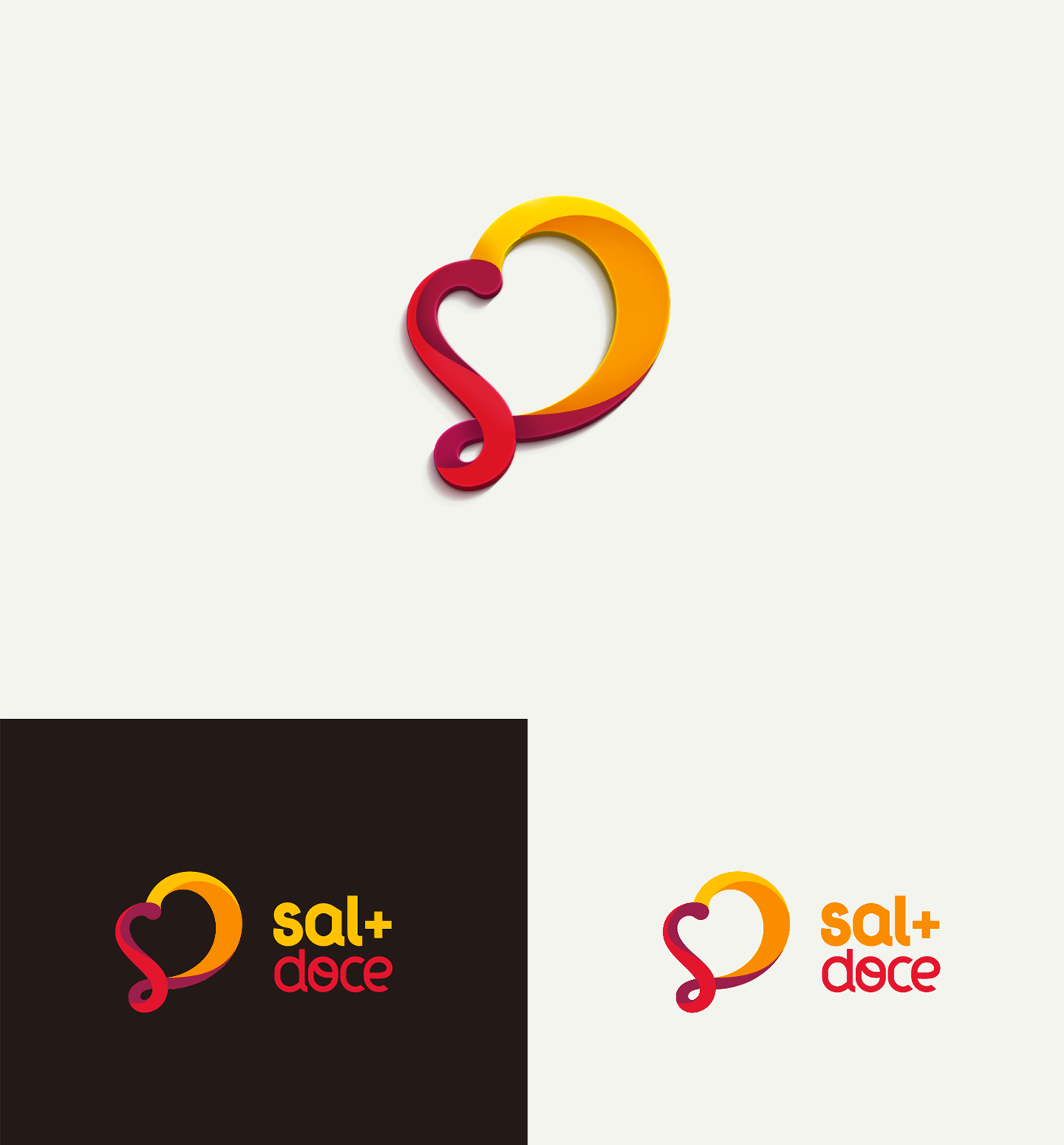
Sal+Doce Identity
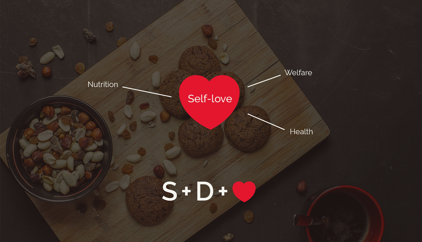
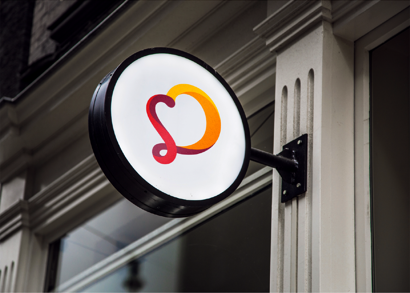
This logo was created for a health foods store where they sell natural grains, cereals, spices and some candies too. The symbol is derived from the words (Sal + Doce) and is based upon the concept of self-love and self-care.
1.Inspiration
2. Final logo
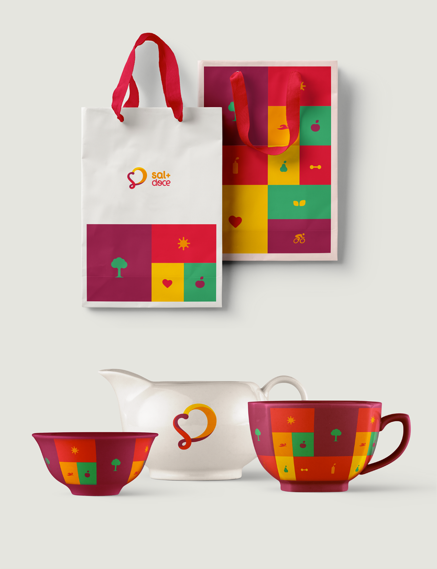
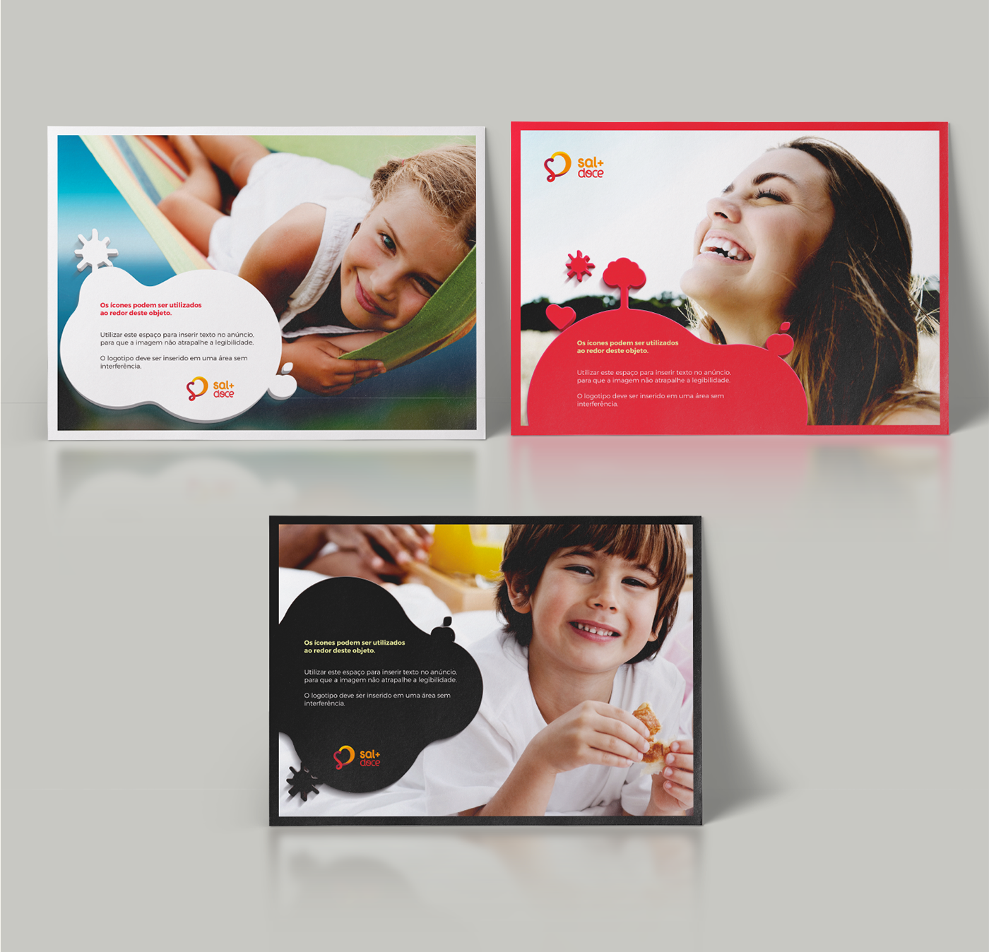
3. Support graphics


Thank you!