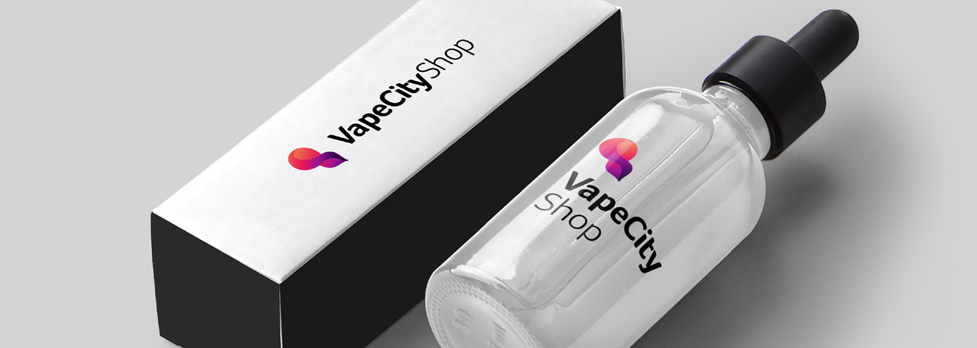
Year: 2017 Client: VapeCityShop
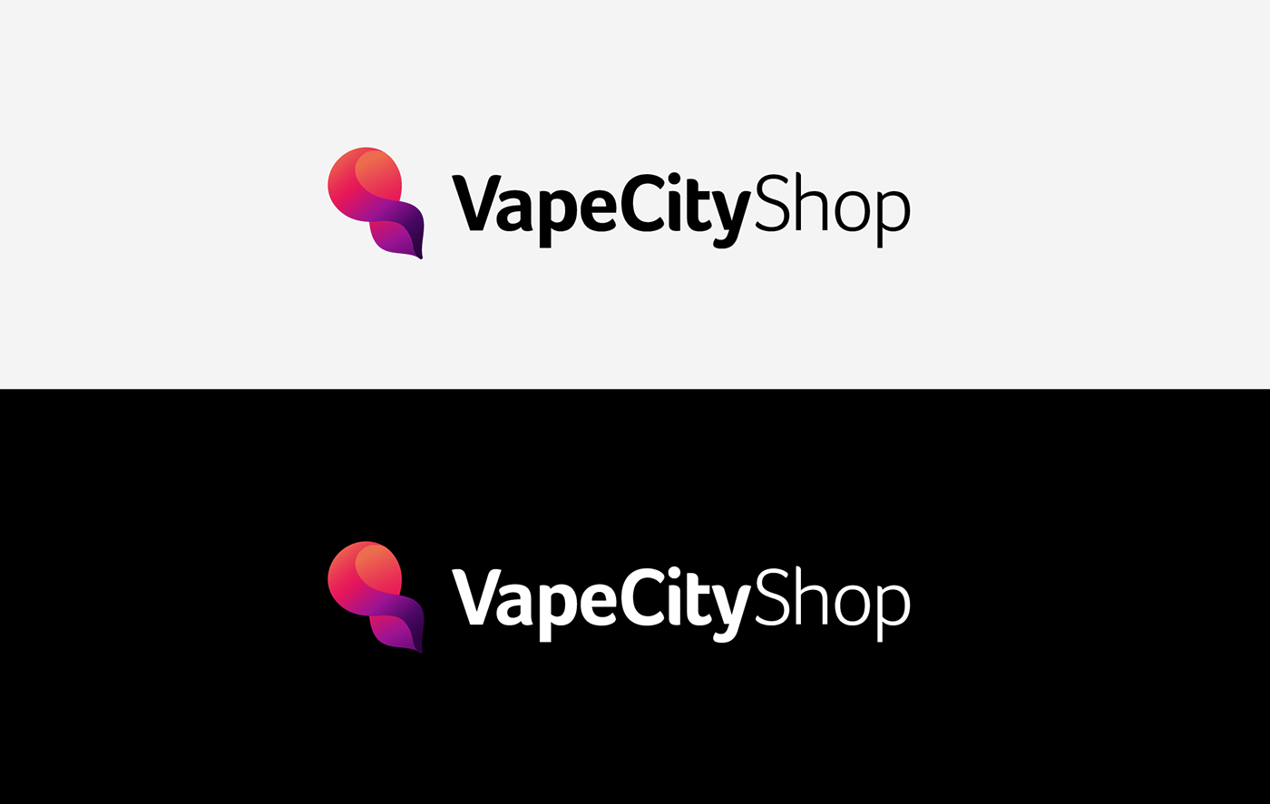
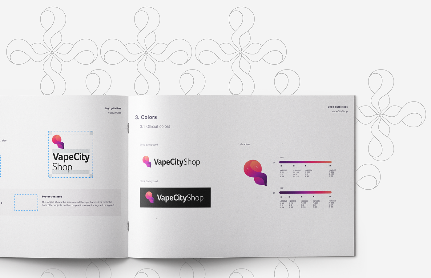
VapeCityShop
Logotype
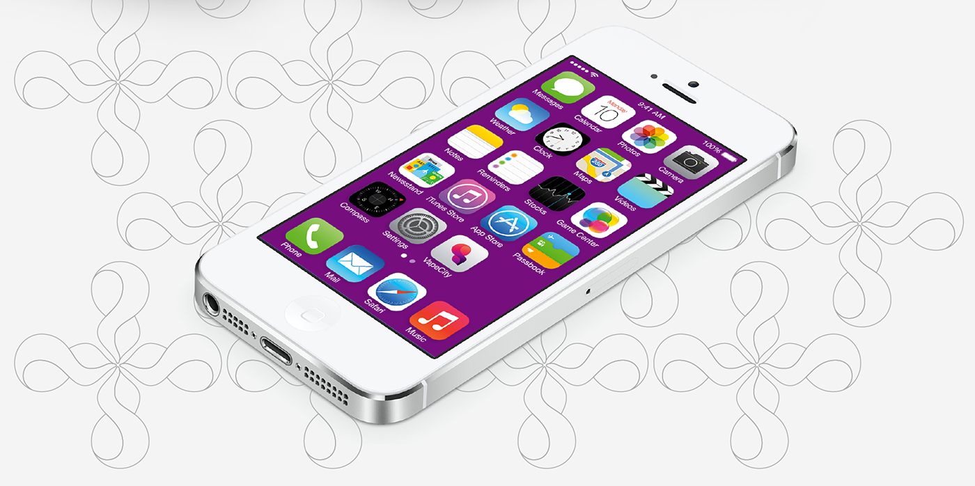
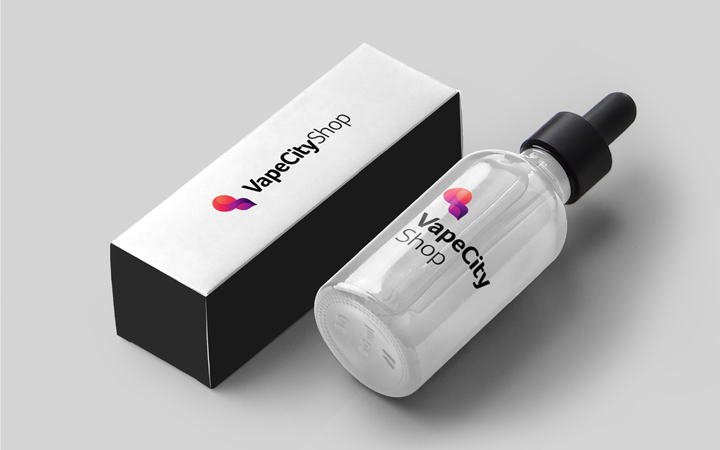
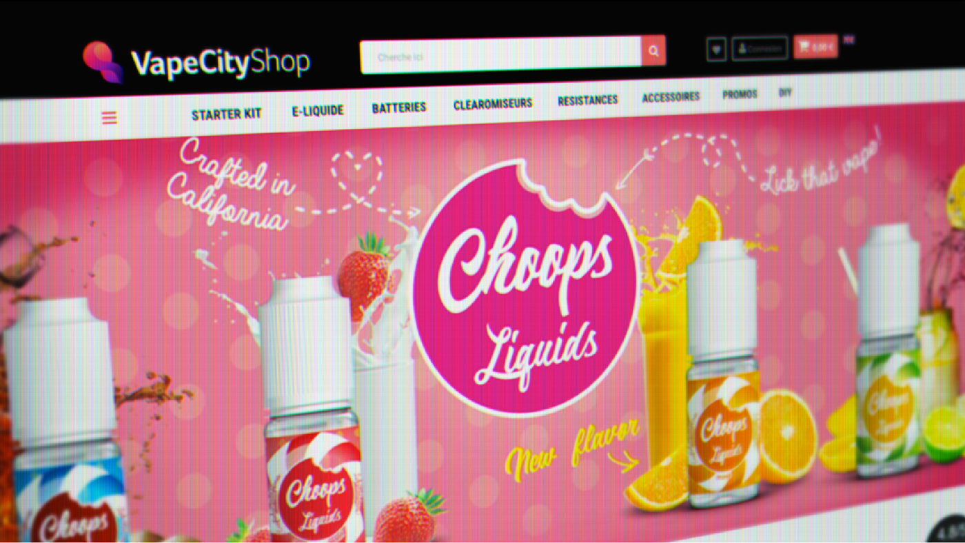
VapeCityShop is an e-commerce, from Compiègne - France, where they sell vaporizers, essences, e-cigarettes and more. My mission was to design a new logo, more original and closer to the product's universe. However, still colorful (yay!).
1.
Old logo

1.1 Symbol:
The symbol looks confusing and busy due to the shapes, colors and letters.
Solution: A more simple symbol, using the colors in a less chaotic style.
1.2 Letters on symbol:
The letters are not readable and hard to memorize all the shapes.
Solution: Discard the use of letters on the symbol.
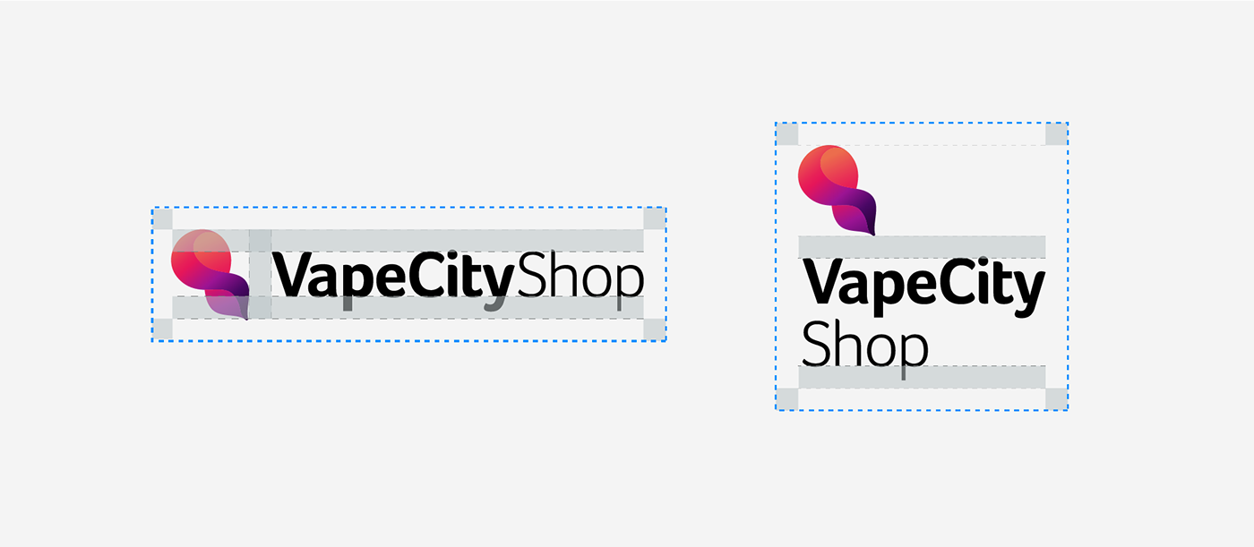
1.3 Lettering:
The letters are too close, thus making the shapes definition low. The spaces between the word make the reading not fluid.
Solution: We can improve the lettering appearance by choosing another typeface and making it look like it has less words.
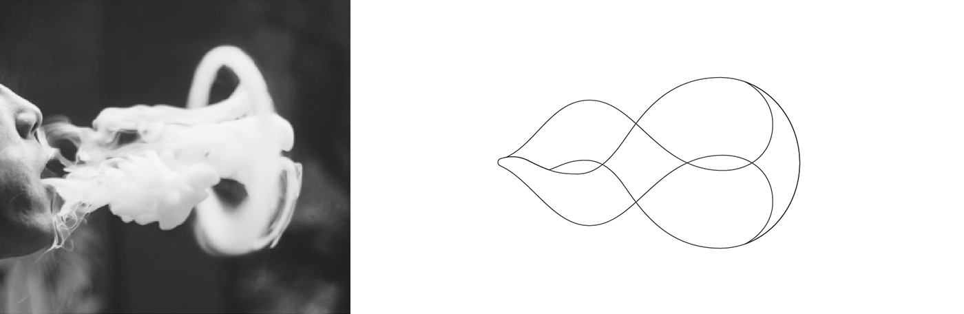
2.
Symbol inspiration
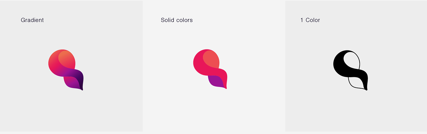
2.1
Colors and shape studies
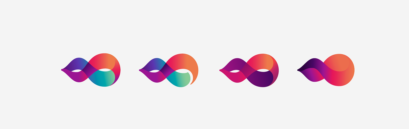
2.2
Chosen option
The client requested me to rotate the symbol, in order to look like the vapor rising.

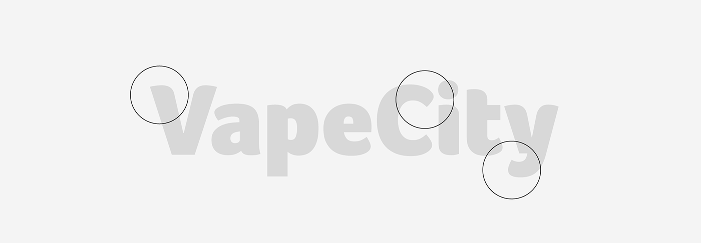
3.
Lettering
'Foco' by Dalton Maag
The font was chosen by the fluid and smooth terminals on the letters and clarity.
4.
Final logo

Thank you!